Ask a Designer: How Do You Choose Paint Colours?
Our pro answers your biggest home renovation question.
Paint can set the tone for a room before you've even added the furnishings or decor—making it all the more important to choose the right colour. No one understands this better than our May Designer of the Month, Maureen Stevens. Lucky for us, she shared all of her paint knowledge and experience, as well as some of her favourite hues, to help tackle some of the most cumbersome dilemmas.
What Matters When Buying Paint?
I keep these three things in mind when shopping for paint:
1. Quality. Many people think all paint is the same, but it's not. Paying a little more per gallon goes a long way. Quality paint provides better coverage and a depth of colour that makes your walls come to life.
2. Eco-friendly and non-toxic. Look for a paint that has no VOCs (volatile organic compounds). By doing so, you are helping the planet and keeping you and your family safe.
3. Vibrancy. There is nothing more disappointing than a paint colour that dries dull and uninteresting. If the name of the paint is bright red, it should be bright red!
How Does Colour Change Mood?
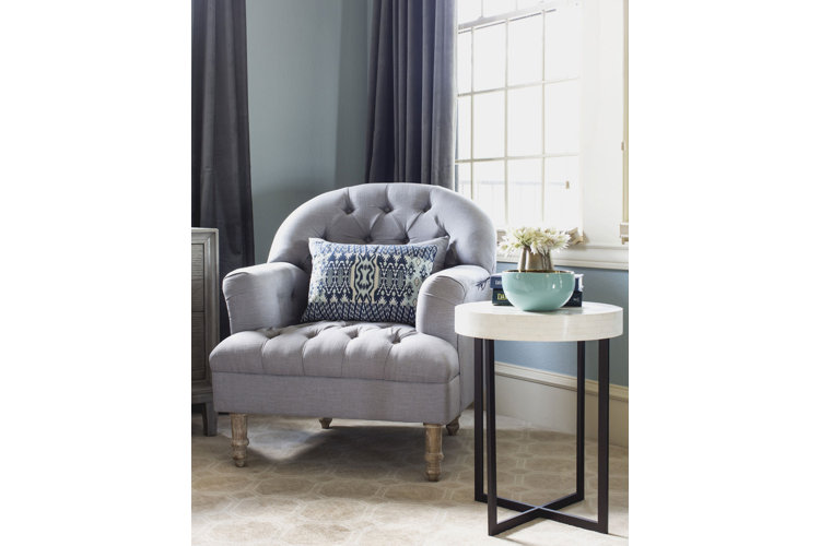
If you want a relaxing space, then go for different shades of the same colour that are more or less tone on tone, such as a room done in creams and whites. If you prefer a bolder look that packs a punch, then consider contrasting colours in brighter hues, such as an orange and blue colour scheme.
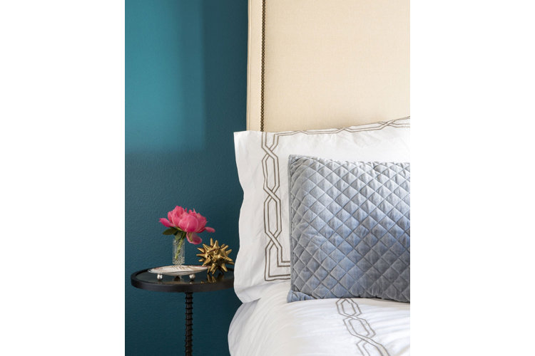
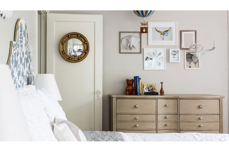
What About White? Black?
White is so versatile, it can be used in pretty much any kind of space—but there's more to white than just one shade. Go for ivories in traditional spaces, bright whites for modern rooms, and warmer tones for a cottage look. They’re also perfect for wide open spaces. On the flip side, I prefer darker colours in small spaces. Some people think that would make a space feel smaller, but it really creates a dramatic mood. I also like it in bedrooms since dark rooms are best for sleep.
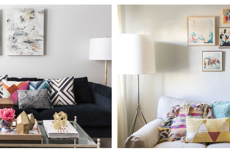
Both of these rooms are painted the same colour, but because of the light in the space and the furnishings, the left one looks cooler and the right one reads warmer.
Tip!
It’s all about the undertone when selecting a paint colour. Be sure to take samples home and look at them during different times of the day to see how they read in your space. Maybe that grey-white really is the way to go!
Accent, or Not?
I’m not usually a fan of accent walls, as I think it makes a space feel choppy, although I do think there are spaces where it works. If you decide to do an accent colour, make sure it feels cohesive with the other elements in the room. Since you are making this the focal point, everything else in the space should pack a punch too.
However, I do like the idea of accenting features in the room. Architectural mouldings are traditionally painted white, but try going in the opposite direction and paint them in a glossy black or dark navy. You can also paint ceiling medallions an ultra-bright colour amidst a sea of white ceilings or try playing up crown mouldings by painting a line around them as a sort of frame.
Go-To Sherwin Williams Colours?
Light French Grey 0055 and Demure 6295
