Home Colour Guide for Beginners
Read how to create your own colour scheme for decorating.
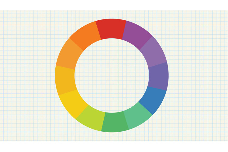
Choosing a colour palette is one of the first steps to decorating a space. When picking a colour scheme, start with pure hues of colour: blue, red, and yellow. From there, build your palette with tints (for lighter values) and tones, also known as shades (for darker values). A colour wheel can help you visualize which hues coordinate to create a well-balanced and unified space. Once you've learned the qualities of these colour combinations, you will be able to create a colour palette that will set the perfect mood throughout your home.
Primary Colours

- Red, yellow, and blue
- These three colours cannot be created by mixing colours. They are their own colours.
Secondary Colours
- Green, orange, and violet
- These three colours are made by mixing together two primary colours.
Tertiary Colours
- Yellow-green, yellow-orange, red-violet, red-orange, blue-green, and blue-violet
- These are colour combinations of a secondary colour and a neighbouring primary colour.
Now that you understand the basic principles of the colour wheel, read on for some examples of how to curate your own personalized palette to suit your unique space.
Monochromatic Colours
A subtle palette made of several shades of one colour, this colour scheme varies from light tints to dark tones, all while staying within the same hue.
Example of a Monochromatic Palette: Blue Hues
This bedroom's use of many shades of one colour creates an intensity that isn't overwhelming. It's a success because it provides an eye-catching balance between neutrals and bright blues. For example, the blue-grey sectional serves as the perfect base for vibrant cerulean throw pillows, while wall art (ranging from powder blue to turquoise) delicately accents the crisp white walls.
Complementary Colours
Made up of two colours, this dynamic, yet simple palette is created by combining colours that sit opposite of each other on the colour wheel. Here are a few complementary colour examples: red and green, yellow and purple, and blue and orange.
Example of a Complementary Palette: Orange and Blue
A popular colour palette, this blend of bright orange and stately blue create a unique yet refined space. Even though the majority of the room features turquoise, the hints of tangerine in throw pillows and accent seating create an energetic feel. A complementary colour scheme such as this provides a clear separation of colours and is often used in more formal spaces, such as dining rooms and living rooms.
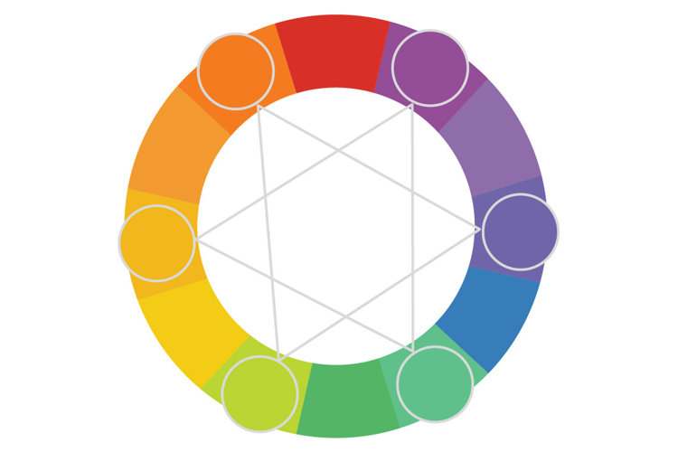
Analogous Colours
Considered a contrast palette made up of two to six colours, these colour schemes sit next to each other on the colour wheel. They're some of the easiest schemes to create. Simply choose one of your favourite colours, and then pick one to four of the colours sitting next to it.
Example of an Analogous Palette: Blue, Violet, and Cream
Blue, violet, and cream create a calming and restful living room. This analogous colour scheme is an ideal combination for a tranquil space, such as a bedroom or family room; the colours flow naturally and mingle seamlessly in any order, creating a space that's easy on the eyes.
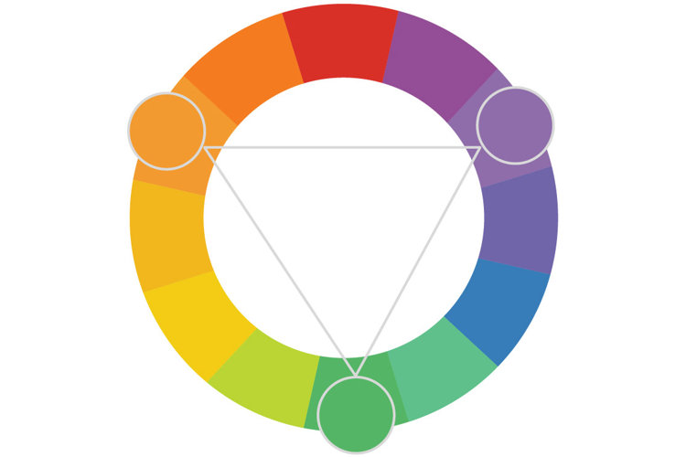
Triad Colours
These colour schemes are made up of any three colours that form a triangle in the centre of the colour wheel. For example: red, yellow, and blue. If mixed correctly, the combination of these colours will make a bold, yet balanced statement.
Example of a Triad Palette: Orange, Magenta, and Green
This triad colour palette of lime green, vivid magenta, and orange hues, creates an energetic and bright living area. Though the three colours make a bold statement, the room is tamed with neutrals, such as crisp white walls, sheets, and side tables.
60-30-10 Rule
For a cohesive look when decorating your space, try the 60-30-10 rule.
- 60% of the room should be dominated by one colour. In the room below, the walls are painted a soft beige, and the sectional mirrors this neutral.
- 30% of the room is the secondary colour, commonly used for window treatments, rugs, or accents. Here, hints of navy serve as the secondary colour in the drapes and other accent pieces.
- 10% of the room is an accent colour. Here is an opportunity to be a little risky. The faded coral, used sparingly in throw pillows and candles, completes the room.
