What Is a Monochromatic Color Scheme?
Discover an effortlessly-cohesive color palette.
The best interior design schemes allow you to do more with less for equally stunning results. Monochrome palettes are easy to replicate and can focus around any color you want, making them super versatile and adaptable. So, what is a monochromatic color scheme? Keep reading to learn all about this must-try interior design method.
What Is a Monochromatic Color Scheme?
Color Theory: Terms to Know for Monochromatic Design
How to Achieve a Monochromatic Color Scheme
What Is a Monochromatic Color Scheme?
A monochromatic color scheme is the use of only one color in different shades, tints, and tones for interior design, art pieces, photography, and even fashion. The monochromatic look gained popularity in the twentieth century as an abstract art movement, but soon took hold in interior design. Interior designers use different shades of one color for furnishings, decor, and wall coverings to create a unique look. Monochrome is popular in minimalist design because it contributes to effortlessly-simple interiors. Overall, monochrome spaces demonstrate that you don't need a bunch of different colors to make a room beautiful, stylish, and captivating.
What Does "Monochrome" Mean?
Monochrome translates from the Greek word, monochromos. “Mono” means one, and “chromos” (derived from khroma) means color, so monochrome literally translates to “one color” or “of one color”. Therefore, when a room is said to be monochrome, this means it was designed using only one color.
Monochromatic vs. Analogous
In order to define monochromatic, you also need to understand how it differs from similar color schemes. Monochrome and analogous both refer to color schemes used in interior design, art, and fashion. The main difference between these color schemes is the range and number of colors you have to work with in each scheme. Monochrome palettes include one single color in different shades, while analogous palettes focus on three separate colors that are beside each other on the color wheel. So instead of an orange room with bright orange furnishings, dark orange walls, and light orange floor covers (monochrome), you would have a room with a combination of orange, red, and yellow colors for furnishings, decor, walls, or floors (analogous).
Benefits of Monochromatic Interior Design
There are so many advantages to going monochrome! Here are some examples of how you and your interiors can benefit from a monochromatic arrangement.
- You don't have to worry about clashing colors in a monochrome space because everything is of the same color.
- You can have more fun with pattern and texture because they bring monochrome interiors to life.
- You have the opportunity to showcase statement furnishings, decor, or architectural details since monochrome palettes limit distraction.
- You can create a sense of calm and relaxation in rooms with muted or pastel monochromatic schemes.
- You can spark energy, intrigue, and creativity in rooms with bold or saturated monochrome color palettes.
- But most importantly, you have permission to go all-out with a color that you love!
Color Theory: Terms to Know for Monochromatic Design
Now that you know what a monochromatic color scheme is, let's break down some key terms to know. Understanding these terms will help you choose the right color variations for a well-balanced monochromatic space.
Hue:
A hue refers to a pure base color within a monochromatic color scheme. Think primary colors like red, blue, and yellow, and secondary colors like green, purple, and orange. Even tertiary colors like red-orange, red-purple, yellow-green, yellow-orange, blue-purple, or blue-green fall under the category of a "hue". You can also use pure black, white, or brown as a base hue.
Does a base color have to be a pure hue?
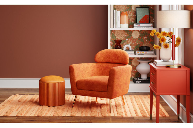
Although pure hues are a great place to start when choosing a base color, you can also go with a tint, shade, or tone as your base color instead! It's ultimately all about choosing a color that you can't get enough of and building the room's color scheme around it. Examples include relaxing colors like sage green, beige, or rose pink, bold tertiary colors like persimmon (red-orange), chartreuse (yellow-green), or aqua (blue-green), and saturated hues like magenta or jewel tones, – any color that speaks to you and matches the energy you want to convey in your space.
Tint:
Tint refers to the base color when mixed with white. Think lighter or more pastel variations of the base color.
Shade:
Shade refers to the base color when mixed with black. This results in darker, more saturated variations of the base color.
Tone:
Tone refers to the base color when mixed with gray (equal parts white and black) in a monochromatic display. This results in a muted, less intense variation of the base color.
Here's a monochromatic example using the color blue:
- Hue: Pure blue, cobalt blue, or aqua blue
- Tint: Pastel blue, sky blue, or baby blue
- Shade: Navy blue, indigo blue, or midnight blue
- Tone: Slate blue, spruce blue, or stone blue
Incorporating a blend of pure hues with different tints, shades, and tones of the same color is what makes a room monochromatic! Our guide on Color Palette Ideas for Living Rooms, Bedrooms, & More gives an overview of color theory and how to establish a color theme in your home.
How to Achieve a Monochromatic Color Scheme
Monochrome rooms can be bold, vibrant, or soothing. In this section, we use the color blue as an example and walk you through how to decide on a base color (hue) for your room as well as how to build on this color for a result that screams monochrome!
1. Choose Your Base Color & Incorporate On a Large Scale
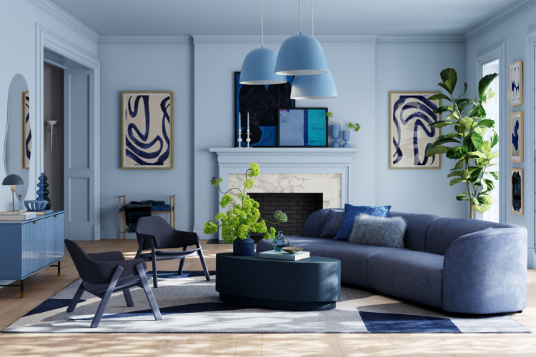
The base color (or hue) is the main color that you'll base your room around, including additional accent tints and shades, so make sure it's one you love. To establish your base color as the main hue in your monochrome room, make sure to use it for large items. Think wallpaper or paint colors, area rugs, and large-scale furniture like sofas, beds, or dining tables. Select the same or similar hues for each of these items for the best results. The living room above uses blue as a loose overarching color for the walls, furnishings, and area rug. This room incorporates furnishings in darker shades of blue to stick to the color theme while adding visual depth to the space. However, you can also match the furniture colors to the wall color (light blue) for a more striking monochromatic look.
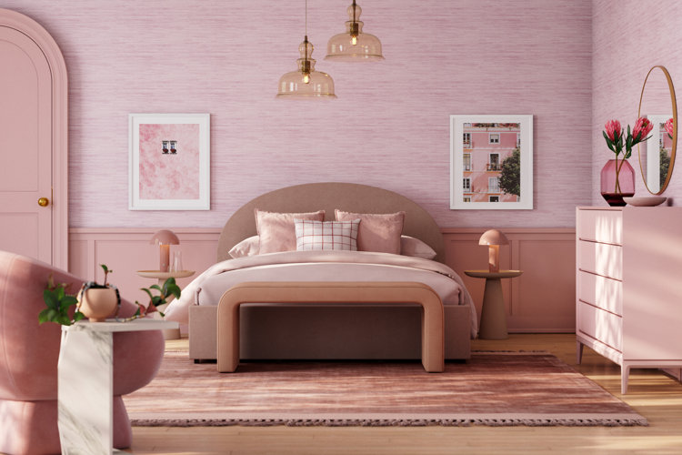
Once you establish your main color, you can decide on light-, dark-, and gray-toned variations to add depth to your monochrome scheme. You can choose whether you want to incorporate all three variations of your base color and how frequently you want to incorporate them into your space. It's all up to you and your style! This blue bedroom demonstrates a well-balanced blend of blue tints, shades, and tones. Shades of light blue appear as the main wall colors, bedding, and accent chair. Muted, gray-toned blue appears in the wainscoted wall detailing, bedside table lamps, and the bed frame. Royal blue throw pillows and pouf ottomans add a bold pop of color, and deep shades of navy help ground the look (as seen in the area rug, nightstands, and dressers). The result is a visually striking room that's saturated in brilliant blue hues!
Tip!
You can easily swap out dark shades of navy for light, bright, or gray-toned blues to accommodate your style and color preferences.
3. Add Hue Variations Through Decor & Accent Furnishings
The best way to incorporate tints, shades, and tones of your base color hue is through decorative accents! This way, you can control how much of a color variation appears in your room while also adding style and personality. Look for artwork that has a mix of light and dark shades of your base hue to bring the room together – abstract art is perfect for this. Pair pastel table lamps with dark side tables or nightstands to demonstrate the contrast between different tints and shades. Pair a deep-hued glass vase with bright- or pastel-colored flower arrangements. This creates a visual dimension that's pleasing to the eye, and allows you to play off of the different tints or shades in the room. You can also use decor shapes, patterns, and textures to add dimension to monochromatic rooms.
The best monochromatic spaces allow room for a pop of color outside of the hue and color variations you choose. A few accents in another color can make the monochromatic palette even more striking and pronounced. Whether through green houseplants, gold picture frames, floral arrangements, or candle holders, there are so many subtle ways to add a fresh pop of color to your monochrome space. This room adds pops of yellow, green, and gold to play off of the saturated blue color scheme, but does so in a way that still allows blue to be the star of the show.
Tip!
Now that we've answered “what is a monochromatic color scheme?”, check out these guides for tips and inspiration to replicate the look in your own home:
16 Monochromatic Rooms: Easy Ways to Achieve Monochromatic Interior Design
Monochromatic Living Room Ideas
Monochromatic Bedroom Ideas
You Might Also Like
Start browsing for furniture and decor to fulfill your monochrome style!
