What Is Chartreuse? Everything to Know About This Timeless Color Trend
Give your interiors a lift.
The right color can help you see your space in a whole new light while adding warmth, interest, and energy. If you're looking for a way to add new life and sensational style to your space, chartreuse could be just what you need! So, what is chartreuse? Keep reading to learn all about this captivating color and how to incorporate it into your home.
What Is Chartreuse?
What Colors Go With Chartreuse?
How to Incorporate the Color Chartreuse Into Your Home
What Is Chartreuse?

Chartreuse is a bold color that takes its name from the famous 17th-century French liqueur: Chartreuse. The drink has a distinct green-yellow hue that inspires a lively, energetic tone. Much like merlot or cabernet red, the liqueur name became the reference example for chartreuse-inspired furniture upholstery, decor, and clothing colors. Despite its boldness, chartreuse is extremely versatile – you can find it in damask patterns in ornate traditional homes or as bold cabinet colors in sleek modern kitchens.
What Does the Color Chartreuse Look Like?
Chartreuse sits directly between yellow and green on the color wheel, meaning it can take on a more yellow or greenish hue depending on the shade. That's why you might see "chartreuse yellow" or "chartreuse green" used as a descriptor– it's because this color can be both! Some examples of shades that fall under the chartreuse category include lime green, avocado, pear, pistachio, or apple.
What Colors Go With Chartreuse?

Chartreuse is warm and cool, being a mix of yellow and green, so there are endless shades you can pair with a chartreuse color palette! We recommend elevating chartreuse color schemes with equally-saturated jewel tones, whether it's ruby, magenta, sapphire, cobalt, amethyst, emerald, bold orange, or turquoise, and the list goes on! Just be careful about pairing it with citrine and other chartreuse-like shades of yellow or green, as these hues may be so similar that they actually clash. If you want to keep bold colors to a minimum, you can easily bring chartreuse down to earth by pairing it with shades of ivory or even chocolate brown. You also can't go wrong with neutral shades of white, gray, and black because they create a fresh modern appearance when paired with chartreuse – take the bedroom above for example!
Tip!
Check out our guides on What Colors Go With Green? and What Colors Go With Yellow? A Comprehensive Guide to learn about more color pairings within the same color family.
How to Incorporate the Color Chartreuse Into Your Home
Now it's time to channel your knowledge of chartreuse into design inspiration. Follow these steps to discover the best ways to add pops of chartreuse to your home.
Introduce Chartreuse Through Decorative Accents
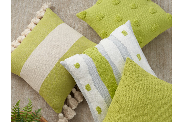
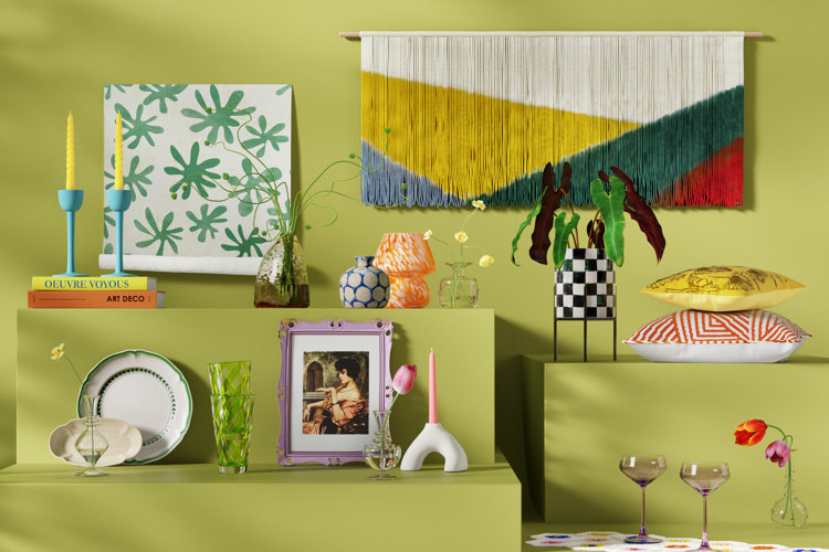
One of the easiest ways to introduce chartreuse to your home is through decor. This will help you ease into the color trend and figure out how it works best in your home. Chartreuse throw pillows are easily swappable and can add a pop of color to neutral sofas, beds, or accent chairs. You can also incorporate chartreuse-colored vases to make flower arrangements really stand out.
The stylish bedroom above incorporates chartreuse shades through quirky abstract artwork, but you can find chartreuse tones in a variety of different art styles. Even with traditional paintings, there's sure to be a piece of artwork with chartreuse hues.
If you absolutely love chartreuse, there's no reason to limit it to decor! Take things up a notch with large-scale chartreuse pieces. Whether it's bedding, a statement sofa, or a showstopping area rug, put chartreuse center stage for it to shine the brightest!
Chartreuse is stunning on its own, but when paired with patterns, it's even more striking. This living room features chartreuse yellow wallpaper with a bold pattern and a striped throw pillow featuring subtle notes of chartreuse to add interest to the space. You can also use patterns as a way to connect chartreuse colors to a room's style. Chartreuse in a damask, toile, or plaid pattern provides a more classic, vintage feel. In contrast, chartreuse in abstract or geometric patterns can appear ultra-modern and eclectic.
Chartreuse is perfect for outdoor spaces because it's refreshing, vibrant, and fun. Incorporate this sunny shade through seat cushions, outdoor throw pillows, patio umbrellas, or outdoor area rugs, and instantly see the results. Whether you want to soak up the sun or host yard game tournaments, you'll be wanting to spend as much time outside as possible.
Tip!
With a better understanding of what chartreuse is, learn about another color taking interior design by storm: persimmon! The Persimmon Fall Color Trend in Every Room explores this captivating shade of orange in more detail.
You Might Also Like
Now that you know what chartreuse is, start browsing!
