What Is Color Capping? The Dramatic New Design Trend
Top it off!
Meet color drenching’s refined older sister: color capping. If you like the look of monochromatic spaces but want more depth, this new trend could be perfect for you. Continue reading for the benefits and styling tips behind the color capping trend.
What Is Color Capping?
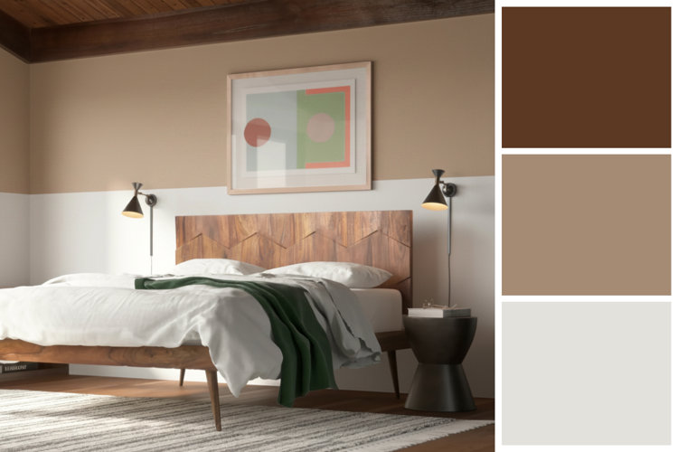
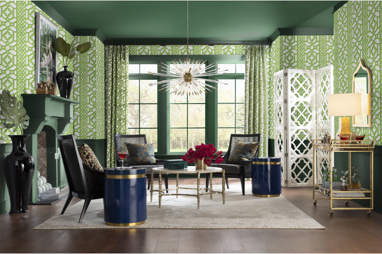
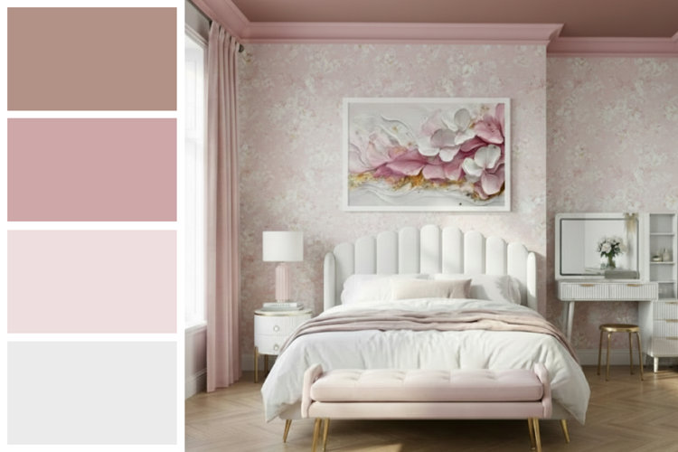
Like color drenching, color capping involves styling a room with a monochromatic color scheme. However, the difference is that color capping focuses on the upper part of the room – hence the name – instead of covering the entire room. Color capping uses different shades of the same color to create a gradient that moves upwards from the walls to the trim to the ceiling, with the darkest color capping it off.
While there are different ways of achieving the color-capped look, the overall effect remains the same. Placing the darkest colors at the top of the room gives a unique top-heavy look that can make rooms with tall ceilings feel balanced and cozy. A painted ceiling is a bold style choice that instantly elevates any room. This color capping trend will make your rooms feel more dramatic, dynamic, and thoughtfully styled.
How to Achieve Color Capping
Color capping requires planning and intentional styling to achieve the desired look. Follow the steps below to help you create the perfect color gradient in your space:
1. Pick Your Colors
When picking the colors for your room, choose at least two colors that are closely related but with slight tonal differences. Colors with the same undertone but different shades will help create the dimensional but cohesive look that’s key to color-capping success. For a simple trick, choose shades from the same paint strip.
2. Start From the Top
Use the darkest tone in your color scheme as the color for the ceiling. This will anchor the gradient in your color-capped room. You can choose to carry this color down onto the wall to give the illusion of shorter ceilings, or you can use a lighter shade for your crown molding for more contrast.
3. Work Your Way Down the Walls
On the main surface of your walls, use the lightest shade of your base color. You can incorporate this color using paint or by opting for wallpaper to give your room an even more dramatic and stylistic feel.
4. Add Division Between Colors
If you choose to show a color gradient on your walls, you can accomplish this in a few different ways. For a smooth, seamless look, you can create a literal gradient with paint that blends multiple shades of the same color. For a more structured look, you can use wall paneling or wainscotting to add separation between the colors of your gradient.
5. Don’t Forget the Details
Complete the cohesive look of a monochromatic room by including door and window casings in your color scheme. You can match the color of your casings and trim to the crown molding to draw the color throughout the room, or use a lighter hue to continue the flow of the gradient on the lower half of the room.
Tip!
For a refresher on similar design trends, read our related guides:
- What Is Color Drenching? A Comprehensive Guide to This Timeless Technique
- Color Drenching Ideas for a Bold & Beautiful Home
- What Is a Monochromatic Color Scheme?
