Color Palette Ideas for Living Rooms, Bedrooms & More
Every space can use a little color.
Choosing a color palette is one of the first steps to decorating a space but it can be difficult knowing which colors will pair well with others. If you need a little extra inspiration to get your decorating process started, we're here to help. Read on to learn more about the basics of color theory and how to use it to craft a showstopping color palette for your home.
In this guide:
Introduction to Color Theory
How to Create a Color Palette
Introduction to Color Theory
Color theory describes the commonly held concepts and guidelines that direct our use of color in aesthetic design. The color schemes outlined by color theory are based on the color wheel, which is a helpful tool for crafting a color palette, as it allows you to visualize how certain colors look alongside others. Keep reading to learn more about the building blocks of the color wheel.
Color Wheel Terms to Know
- Primary Colors: red, yellow, and blue. These three colors cannot be created by mixing other colors.

- Secondary Colors: green, orange, and violet. These three colors are made by mixing together two primary colors: blue and yellow for green, red and yellow for orange, and blue and red for purple.
- Tertiary Colors: yellow-green, yellow-orange, red-violet, red-orange, blue-green, and blue-violet. Tertiary colors are created when you combine a secondary color with a neighboring primary color.
- Hues: Many terms for colors and their light and dark versions overlap in definition. In this guide, the term "hue" will describe a color in its purest form, without the addition of light or dark.
- Shades: Shades are darker versions of a hue that exist on the spectrum between that hue and the darkest black.
- Tints: On the other side of the spectrum are tints, the lighter versions of a hue that exist between that hue and total white.
How to Create a Color Palette
Once you're familiar with the colors on the color wheel, their relationship to other colors, and their lighter and darker variants, you can start putting these pieces together to create home color palettes of your own. If you still need good color combination inspiration, there are several preestablished color schemes you can choose from. Below we list five color palette ideas for each main type of color scheme.
1. Go for a Monochromatic Look
Monochromatic color schemes entail subtle color palettes made up of tints and shades of one hue. To create a monochromatic color palette, choose one central hue and decorate with a range of colors on the light and dark sides of that color's spectrum.
Monochromatic color schemes typically have light base colors of white or light gray that allow the central hue and its variants to pop. Some monochromatic color palettes are made up of just white, black, gray, and a single vibrant accent hue. For a bolder aesthetic, forgo the neutrals and color drench your room with one color in various shades, tints, and hues.
Tip!
Loving the monochromatic look? Check out Easy Ways to Achieve Monochromatic Interior Design and What Is Color Drenching? A Comprehensive Guide to This Timeless Technique for more inspiration and styling tips.
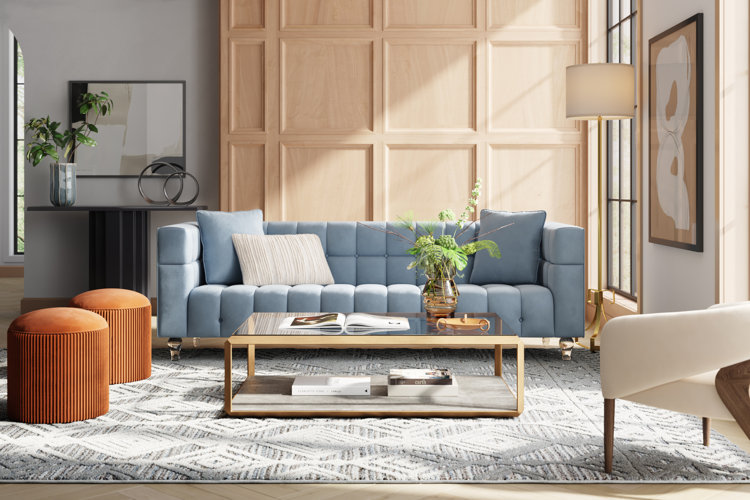
Made up of two colors, this dynamic yet simple color palette idea is created by pairing colors that sit on opposite sides of the color wheel. The most basic combinations are red and green, yellow and purple, and blue and orange. You don't have to strictly abide by those pairings – as long as the two colors you choose generally oppose each other on the color wheel, you'll be able to create just as much striking contrast.
Complementary color schemes aren't characteristic of any specific home decor style, but because of the contrast they create, they alone can contribute to an eclectic finished look. In the above green-orange complementary color palette idea, contrast is created between the wall color, area rug, artwork, and pillows.
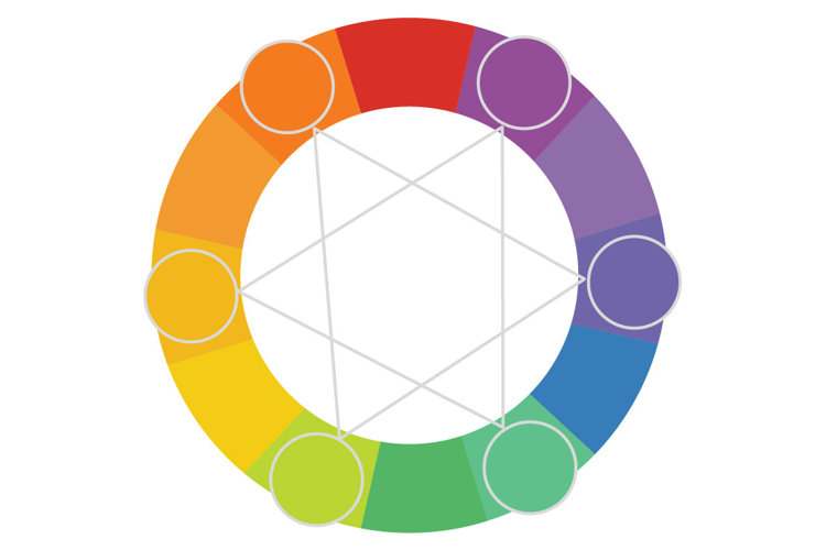
Made up of two to six colors, analogous color schemes are made up of hues that neighbor each other on the color wheel. They're some of the easiest and most vibrant color schemes to create. To put together an analogous color palette, simply choose one of your favorite colors and then pick a range of one to four of the colors next to it on the color wheel. These color palettes look gorgeous on a base of neutrals, but they are forgiving no matter how you choose to use them.
Analogous color schemes are incredibly conducive to the use of eccentric decorative objects and accent pieces. No matter what color scheme you've chosen, you'll be able to find a variety of unique decorative pieces that will fit right in.
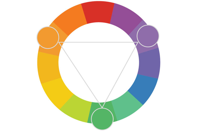
Triad color schemes are made up of any three colors that form a triangle in the center of the color wheel. For example: red, yellow, and blue. Triad color schemes are a step above complementary color schemes when it comes to stunning contrast. Where complementary color schemes can benefit from a wide range of supplementary tints and shades, the impact of triad color schemes can be diluted if too many color variants are used. If you want to implement this color scheme, try to stick to just the three main colors and assist with subtle neutrals.
An easy way to add splashes of color to a triad color scheme is to hang wall art. Without much embellishment, walls in colorful rooms can look especially bare. Supplement the room's style by hanging wall art that corresponds to the color palette you've chosen.
For a cohesive look when decorating your space with your chosen color scheme, try the 60-30-10 rule. 60% of the room should be dominated by one color. Most often, a neutral works best as the dominant color and provides the perfect canvas for accents. 30% of the room should be decorated with the secondary color. This color can be displayed on broad surface areas, such as window treatments, rugs, or large furniture pieces. Finally, 10% of the room should be decorated with an accent color, usually the brightest color in your palette. Used sparingly, even the most vivid of colors can look striking and tasteful.
In the above color palette idea, 60% of the room is made up of light neutral colors like ivory and pale gray – with large fixtures like walls, furniture, and the area rug providing a neutral foundation. 30% of the room features a bright green color displayed on the trim, bookshelves, and sprinkled throughout the decor. Shades of muted red serve as the 10% accent color on throw pillows, blankets, and wall art.
Tip!
For more inspiration read our related guides on styling and color palettes:
- Tips for How to Decorate a Home (Using Cohesive Design)
- Terracotta Color Palettes to Fall For
- Jewel Tone Color Palettes for Depth & Drama
