Terracotta Color Palettes to Fall For
Your new favorite hue.
Terracotta is a popular color for its ability to bring warmth and earthiness to any space. Before incorporating this versatile color into your home, consider the following terracotta color palettes to help guide your design decisions.
What Is Terracotta Color?
Terracotta is a warm earth tone found somewhere between rust red and muted orange on the color wheel. The color is inspired by the natural reddish-brown clay commonly used for pottery, whose distinctive color occurs when iron in the clay oxidizes during the firing process. Despite its ancient origins, terracotta has become a hugely popular color in interior design and home decor.
Terracotta Color Palette Ideas
Want to bring this color trend to your home but still unsure what colors go with terracotta? Whether you’re looking for timeless neutrals or unexpected accent colors, check out the color palette ideas below for inspiration.
1. Desert Sunrise: Warm Hues
Stay true to the natural origins of terracotta with a desert-inspired color palette. Pair terracotta with a dark reddish-brown, dusty orange, and muted yellow for a color scheme that evokes the feeling of hot sand and sun-baked redstone. This warm-toned palette is great for Southwestern and organic modern interior design styles that need an energy boost.
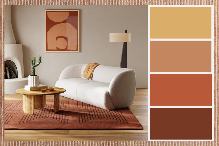
If you’re drawn to a subtler color palette, consider using terracotta as an accent color against a base of soft taupe, espresso brown, and slate gray. These earthy neutrals will allow the terracotta accents to really shine in your space without overwhelming it with color. Incorporate natural stone and unfinished pottery to bring organic texture to a modern home.
Pair terracotta with vibrant earth tones of similar saturation like mustard yellow and olive green – using shades of ivory and brown for balance. This autumn-inspired color scheme is the perfect way to warm up a modern space or bring unexpected color to a rustic home. Don’t forget to include natural wood finishes to ground this color palette in warm neutrals.
Looking to create a soft, feminine aesthetic? Design a pastel color palette with salmon pink, creamy yellow, and mint green to balance the rich saturation of terracotta. These light tones are sure to brighten up your home with springtime hues that complement a cottagecore style. Decorate with whimsical florals and timeless patterns to add dimension to this color palette.
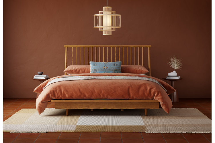
Balance the warmth of terracotta with a palette of cool blue tones ranging from navy to steel blue. When choosing different shades of blue, focus on creating harmony and depth rather than finding a perfect match. This cool-toned color palette will bring a calming effect to your home and is perfect for transitional or mid-century modern homes.
Embrace the natural elegance of the Italian countryside with a color palette of rich burgundy, terracotta, sage green, and sandy beige. Draw inspiration from the vine-ripened grapes and sun-warmed olives to give your color scheme an organic feel. These vineyard-inspired hues will bring a timeless Tuscan aesthetic to any traditional or transitional-modern home.
