What Are Muted Colors & How to Use Them in Your Home
Make a subtle statement.

Muted colors are soft, desaturated shades created by blending pure hues with gray, brown, or complementary tones. By softening a color’s intensity, muted tones bring an earthy, timeless, and calming feel to any room. Read on to learn what muted colors are, explore beautiful palette combinations, and discover easy ways to style them throughout your space!
What Are Muted Colors?
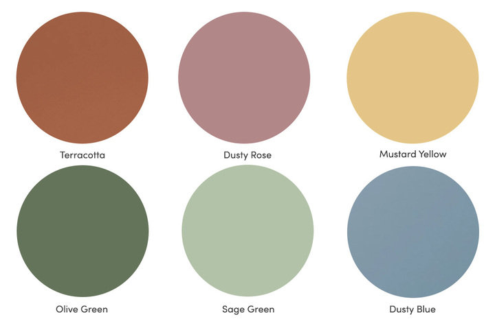
Muted colors are subdued shades that have been diluted to create softer tones. This visual "softening" shifts a color from bright and energetic to grounded and subtle – turning vivid primary blue into a calm slate, or intense grass green into an earthy olive. In home decor, desaturated colors are prized for their ability to bring depth, complexity, and a sense of effortless relaxation to a room. Often, muted colors have a washed-out appearance or slightly gray tint that makes them more subtle and natural looking. Some common muted tones are dusty blue, sage green, olive green, dusty rose, and terracotta. Taupe and charcoal gray are examples of muted neutral colors because they are less saturated than chocolate brown or pure black.
How Muted Colors Are Made: Desaturation Explained
Muted colors are created through desaturation – the process of blending a pure hue with gray, brown, or its complementary color. Unlike vibrant primary tones, muted colors feature a washed-out, earthy quality that tones down brightness while adding visual depth. Think of gentle sage green instead of vivid lime, or warm terracotta instead of bright primary red.
Muted Colors vs. Pastel Colors
While both palettes offer a softer alternative to bold primary colors, they differ in how they are mixed and their overall depth:
- Muted Colors: Made by adding gray or brown to a pure color. This reduces saturation and darkens the shade slightly, resulting in grounded, subtle tones with a grayed or earthy undertone.
- Pastel Colors: Created by adding white to a pure color. This lightens the hue to create airy, pale tints like baby blue, icy lavender, or soft blush pink.
While pastels feel sweet and whimsical, muted tones bring a more grounded, sophisticated, and mature feel to home decor.
Muted Colors vs. Neutral Colors
Neutral colors like white, beige, cream, grey, and black serve as quiet, versatile backdrops in interior design because they lack strong color undertones. Muted colors differ by retaining a distinct color family (such as green, blue, or red), but they are softened enough to act as "new neutrals." Incorporating muted neutral colors like taupe, charcoal grey, and warm greige allows you to introduce subtle color while keeping your space clean and versatile.
Muted Colors vs. Dusty Colors
In home decor and interior design, "dusty" and "muted" are essentially interchangeable terms. "Dusty" specifically describes muted colors with strong gray undertones that give them a slightly faded, vintage appearance. Common examples include dusty blue, dusty rose, and sage green.
Why Use Muted Colors in Your Home?
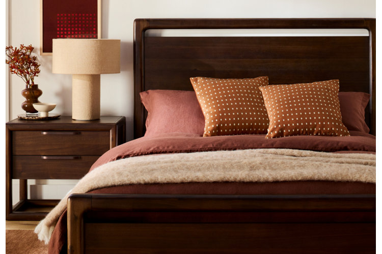
Using muted colors in your home allows you to create a relaxing and timeless atmosphere that you can enjoy for years to come.
Calming Effect & Color Psychology
Color has a powerful impact on how a space feels, making muted palettes ideal for creating peaceful home interiors. The lower intensity creates a naturally soothing effect that allows your eyes – and your mind – to rest. Incorporating muted tones like soft sage, gentle lavender, or dusty blue into high-relaxation areas like living rooms and bedrooms fosters an inviting, stress-free atmosphere.
Explore how specific shades influence your space's overall mood with our guide on What Colors Are Calming? A Guide to Creating a Relaxing Space.
Timeless Style Across Design Aesthetics
Muted color palettes offer an enduring elegance that easily adapts to shifting interior design trends. Their subtle undertones allow them to pair seamlessly with a wide range of natural materials – from rich wood flooring and textured rattan to polished stone and metallic accents.
Whether your home leans toward modern minimalist, rustic farmhouse, or classic traditional, muted colors act as versatile neutrals. They allow you to infuse personality and color into your decor without overwhelming the room, giving you a timeless interior design.
How to Decorate With Muted Colors
1. Pick a Muted Wall Color
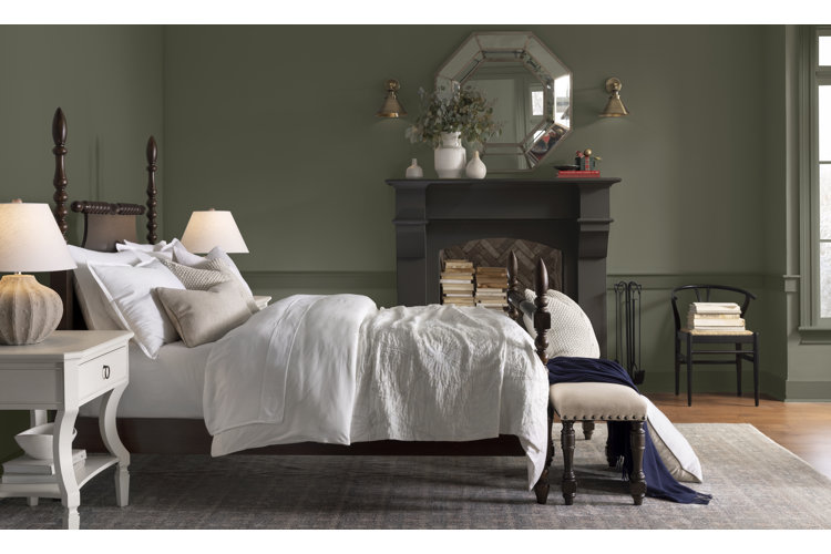
Whether you opt for paint or wallpaper, putting a deep muted color on your walls is a great way to warm up the space. Combined with the wall moldings and traditional style of the room, this olive green wall color really enhances the timeless elegance of the bedroom.
Use a colorful area rug to tie together your space and center it around a muted color palette. Oriental rugs often include muted colors like terracotta, and vintage-look rugs have a slightly faded appearance – making both great options for bringing subtle color to your space.
Consider choosing a muted bedding set as a focal point of subtle color in your bedroom. Dusty blue is a beautiful color to use in a bedroom as it has an especially calming feel. Pair it with other muted colors like sage green or dusty rose for a soft but stunning color palette that will transform your space into a restful sanctuary.
If you’re looking to make a bold statement while maintaining a subtle color palette, consider choosing a muted color for one of your main furnishings. This dusty rose sofa, for instance, brightens the living room with soft color without being too overpowering among its neutral surroundings.
Styling colorful accent furniture is a simple way to bring pops of color to an otherwise neutral space. These mustard yellow accent chairs and terracotta-colored ottoman add visual interest to this living room while complementing the ivory and natural wood used throughout the space.
Neighborly Tip!
Read our guide Color Palette Ideas for Living Rooms, Bedrooms & More for tips on creating your own color palette.
6. Add Unexpected Pops of Color
Don’t be afraid to get creative with how you incorporate a muted color scheme into your space. Add wallpaper to an accent wall or alcove or paint your door a muted tone to bring color to your room in an unexpected way. Then finish off the room by tying in these colors with accent pillows, throws, and decor.
Neighborly Tip!
For more ideas to help you discover your personal color palette, check out these guides:
- Decorating With Neutrals: How to Achieve a Well-Balanced Space
- Your Guide to Decorating With Color the Fun Way
- What Are Jewel Tones & How to Decorate With Them
Frequently Asked Questions
What are the best muted colors for home decor?
Some of the most popular muted colors include sage green, dusty blue, olive green, dusty rose, terracotta, taupe, charcoal gray, and warm greige. These soft, desaturated shades create a calming, timeless look that works well across many design styles.
What colors pair well with muted palettes?
Muted colors pair beautifully with neutral shades like white, ivory, beige, cream, and gray. They also complement natural wood tones, stone, rattan, and metallic finishes, making it easy to create a balanced, layered space.
Are muted colors still in style?
Yes. Muted colors remain popular because they create a timeless, versatile look that works with a variety of decorating styles, from modern minimalist to rustic farmhouse and traditional interiors.
What's the difference between muted colors and pastel colors?
Muted colors are created by adding gray, brown, or a complementary color to reduce saturation, while pastel colors are made by adding white. Muted shades feel more earthy and sophisticated, whereas pastels have a lighter, more whimsical appearance.
Which rooms are best for muted color palettes?
Muted colors work well throughout the home but are especially popular in bedrooms and living rooms, where their soft tones help create a calm, relaxing atmosphere.
How can I add muted colors without repainting my walls?
Introduce muted colors through area rugs, bedding, sofas, accent chairs, throw pillows, or decorative accessories. These pieces add subtle color while keeping your space easy to update over time.
Can you mix different muted colors together?
Yes. Muted colors layer well together because their softened tones don't compete for attention. Combinations like sage green and dusty blue or terracotta and mustard yellow create a cohesive, inviting palette.
